w.lift – UX/UI Case Study
Goal
Helping healthy people (or who wants to be like that) by creating a new app
Role
Individual project
Methodology
Design Thinking
UX – Research
Let’s start at the beginning: what’s the main problem?
There are several factors that interfere with the process of those individuals who want to improve their body: some don’t know where to start, they are unsure how many times a week they should train, what exercises to do, or the proper technique…
What’s the people opinion?
After conducting a series of surveys, 75% of the total respondents admitted to being beginners in the world of training, and 92% of the people to whom the idea of creating a completely free app that would guide them, even with professionals they could hire through it for personalized training tailored to their abilities, be it age, level, any injuries, and other characteristics, found it to be a fantastic idea
- The 92% of respondents give a resounding YES to the app
- 75% are beginners who would like to start training seriously to improve their health or physique
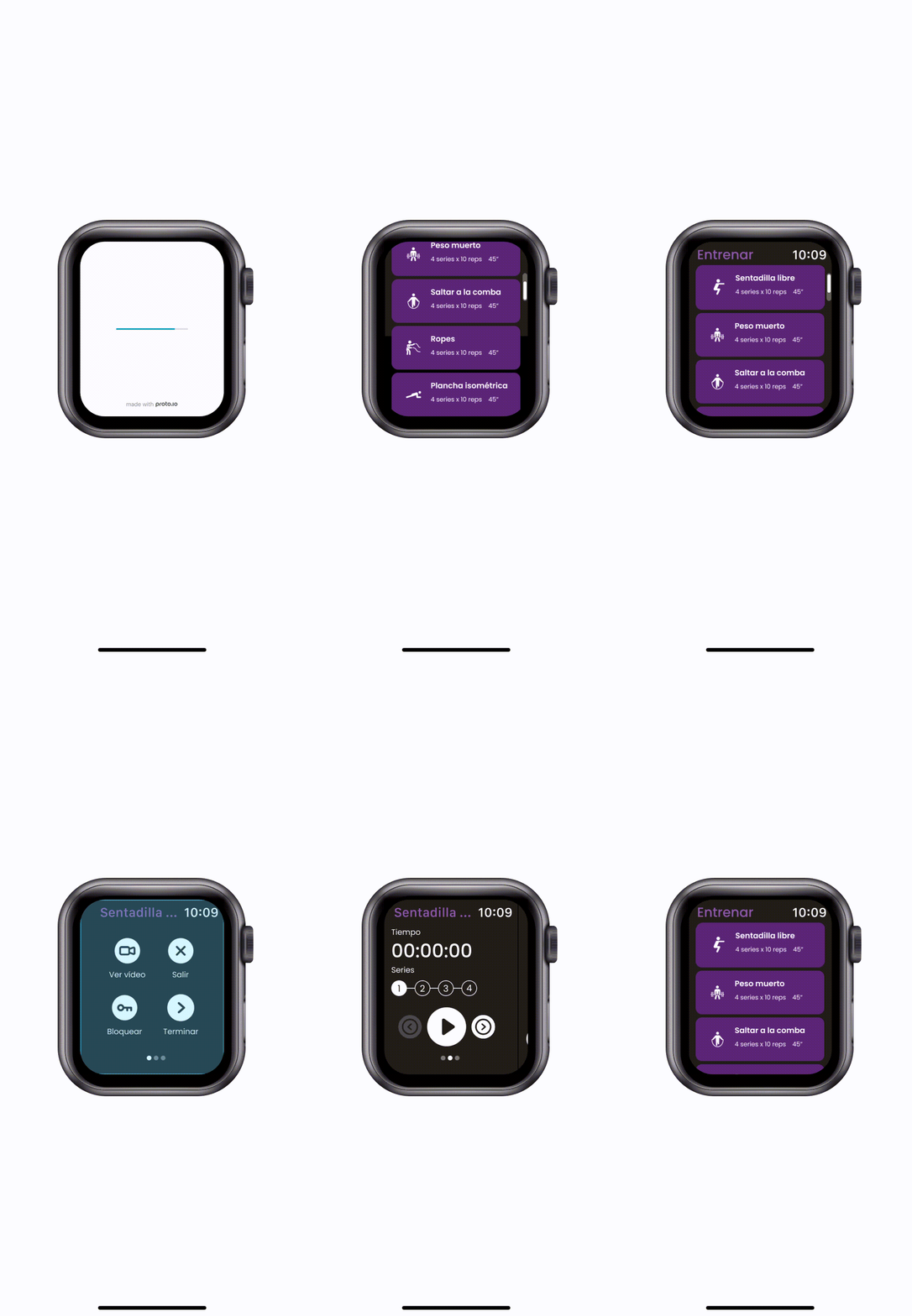
- Moreover, 68% of these individuals also use a smartwatch during their gym workouts
- Almost 42% would like to use a training app to track their progress even though they workout on their own. In addition, 100% of respondents would love the app to include a coach and/or nutritionist completely for free
Who are the main competitors?
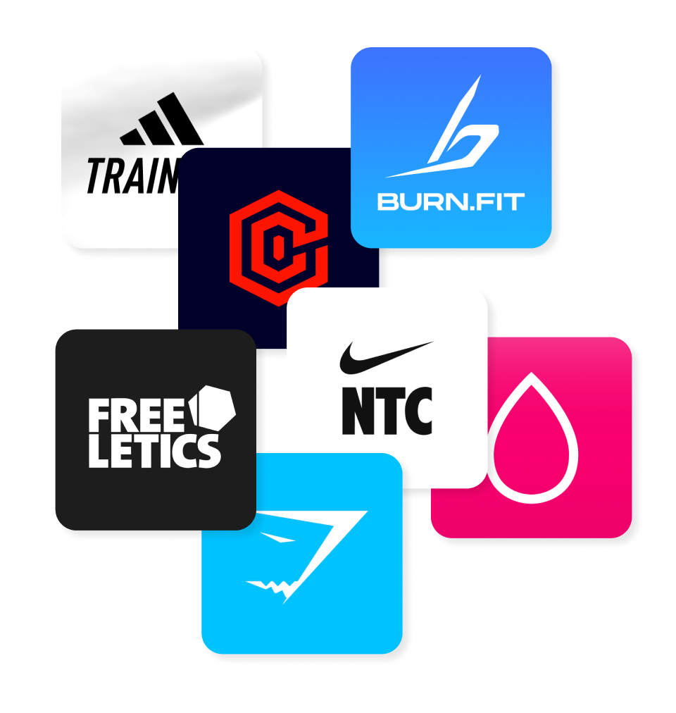
This led to a study of competitors such as Adidas, Nike, Freeletics, Gymshark and Sweat, among others.
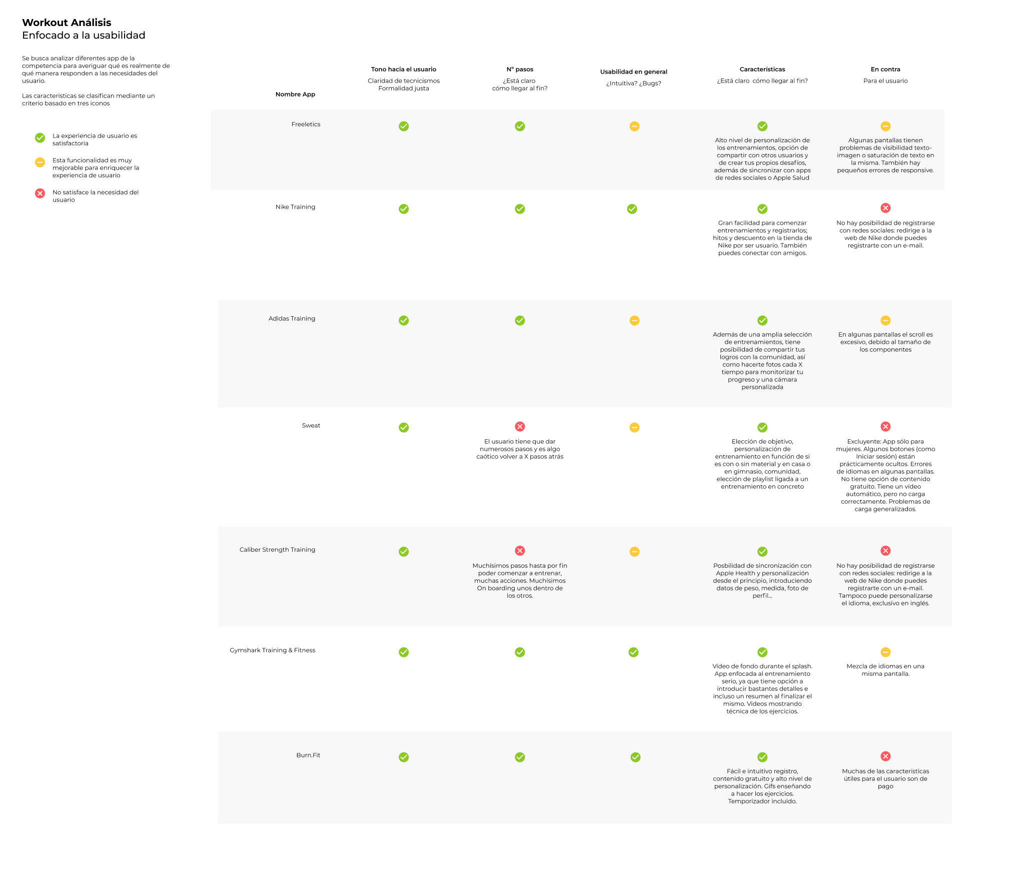
By analysing a number of features of competitor applications, it is determined which points should be added and which should stand out even more than those already present in other apps:
Which are the goals?
In this way, the conclusion was that there were several essential goals that the new product had to meet in order to satisfy user needs:
- Facilitate the users’ daily training routines
- Guide and motivate them throughout the process
- With the possibility of being under the guidance of a professional who always looks out for their goals”
Who would be the ideal client for this app?
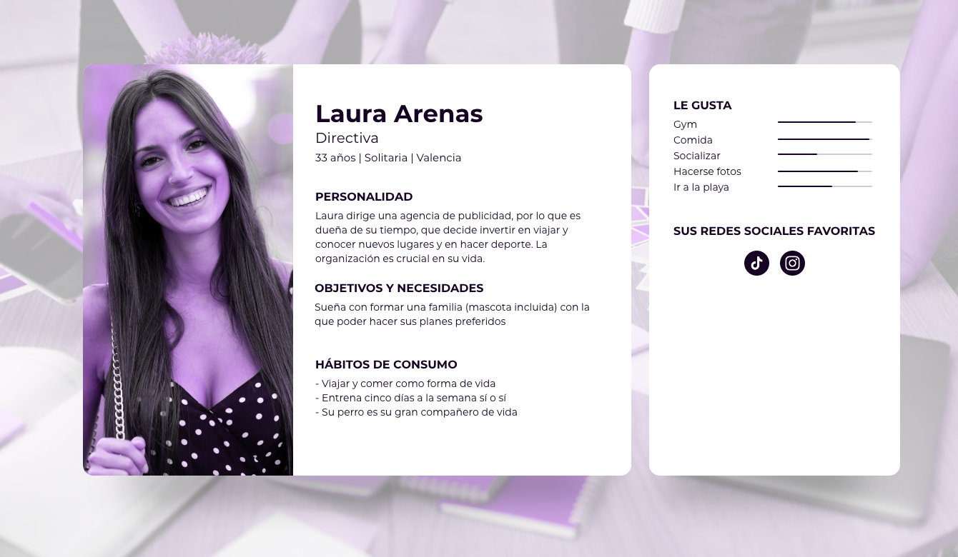
First of all, there is Laura, a young, hard-working manager who loves training in the gym but is also very family-oriented. Food is another of her passions and priorities in her daily life.
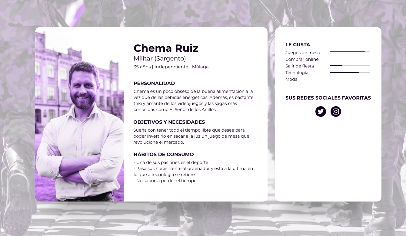
Another of our profile types is Chema, who is a bit older but still in the young people’s range. He likes to spend more time at home in front of the computer, but he always keeps going to the gym as one of his priorities whenever he can.
UX – Design
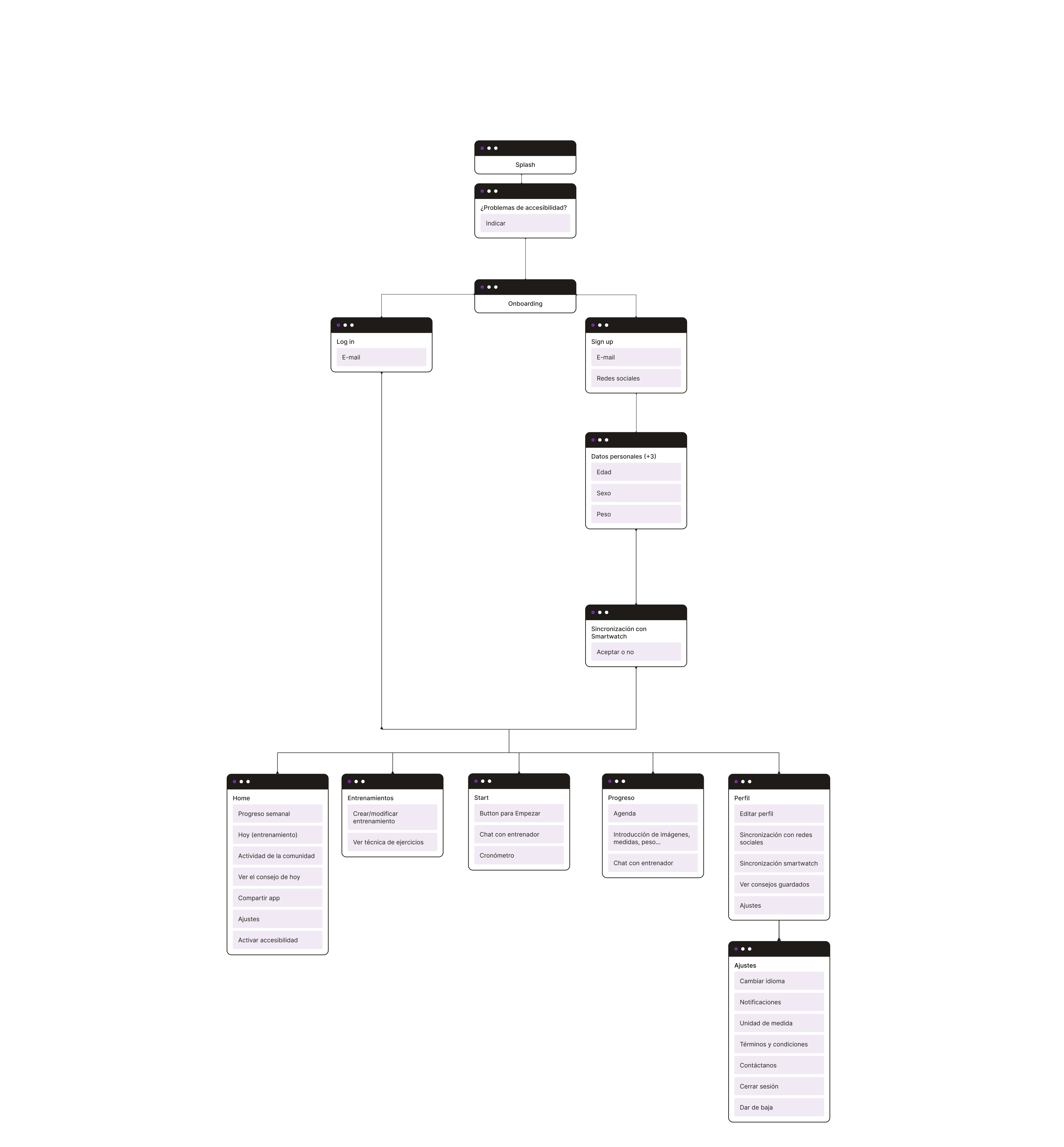
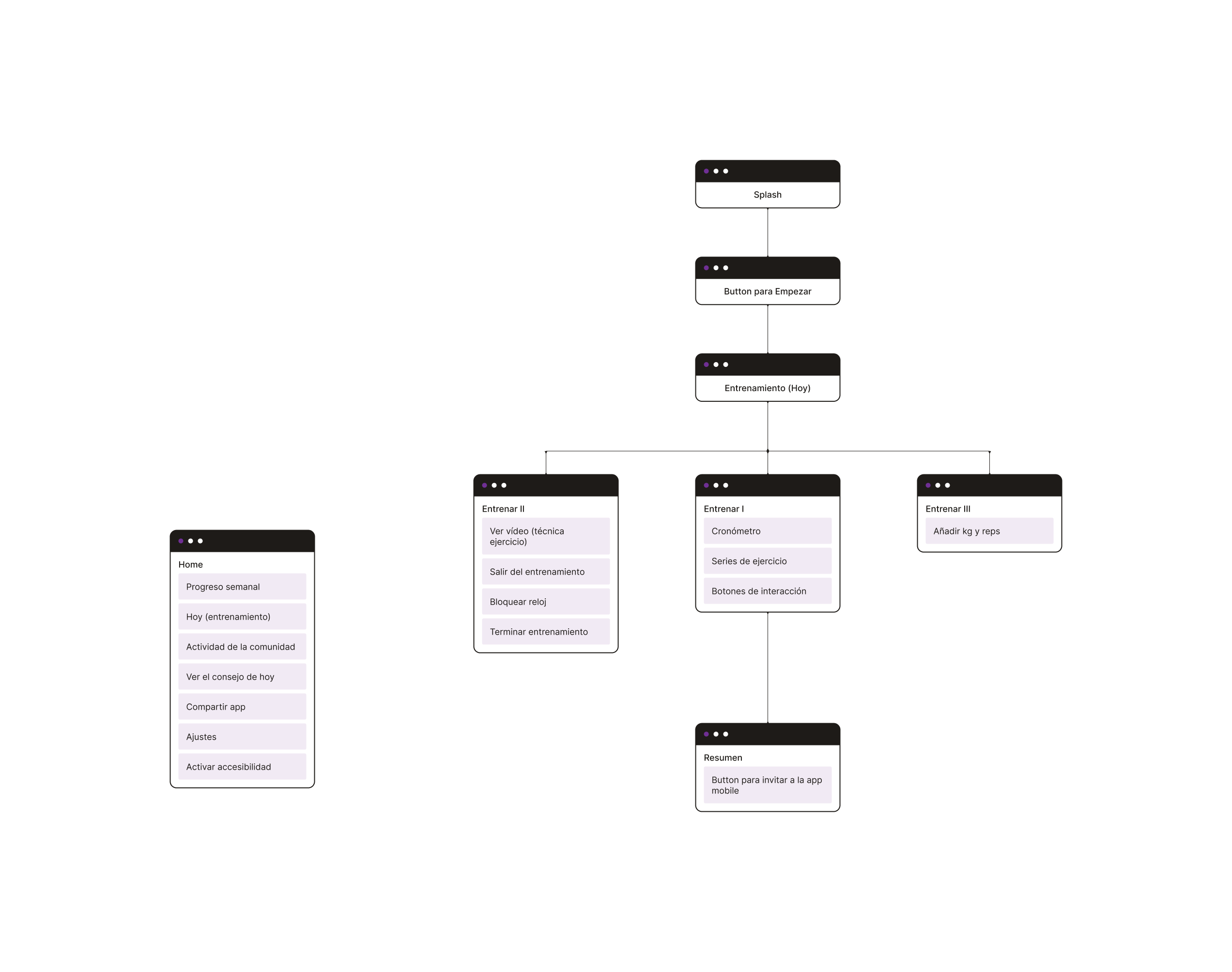
Defining the architecture
UI – Design
Creating the branding
Four concepts are defined: gain (muscle gains), workout (exercise in English), lift (lifting weights), and eat (since nutrition is closely linked to exercise and vice versa). Why “lift”? Well, because it could be said to encompass all the concepts mentioned earlier, it’s easy to remember, and virtually anyone in the fitness world will recognize it
What about colours?
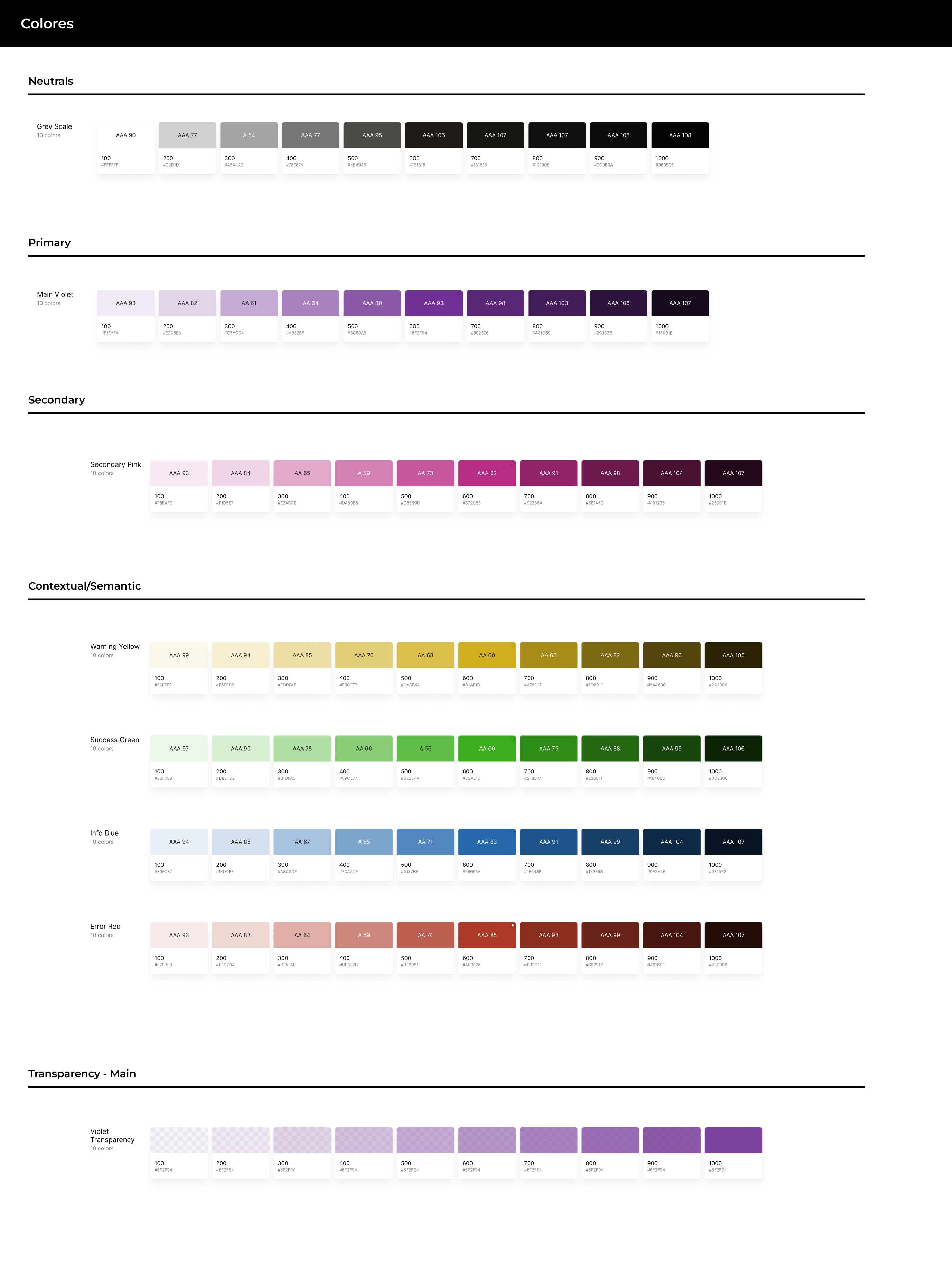
The main chosen color palette encompasses a primary shade of purple, complemented by pure white and black, to convey the ideas of youth, power, ambition, strength, and within a sports context, control and dedication

#592676

#1E1B18

#FFFFFF
The secondary colour palette is also defined, as well as the contextual palette and the transparency palette.
Let’s complete with typography
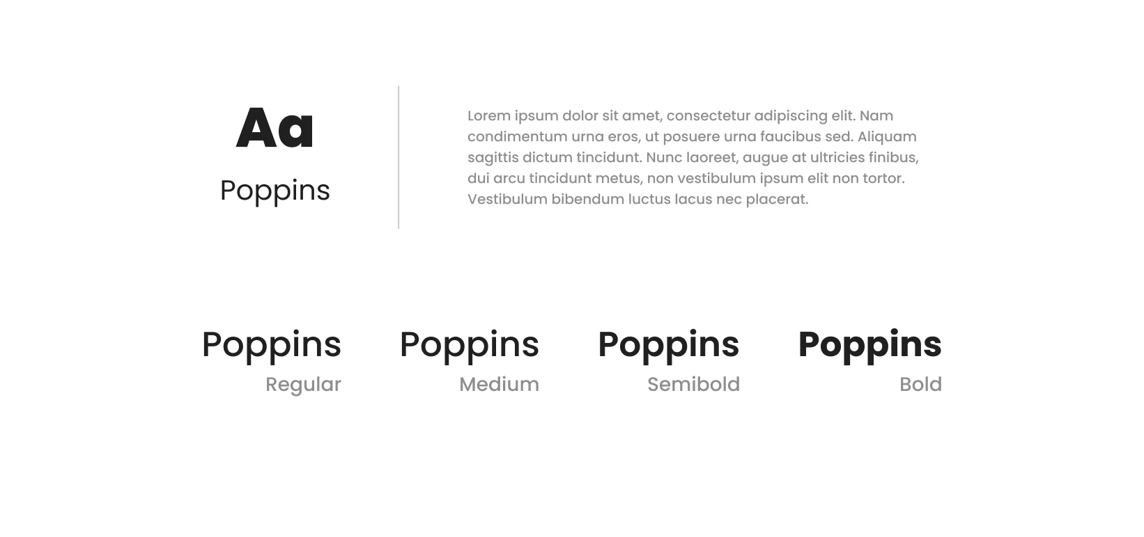
The chosen typography is Poppins, a sans-serif font with good legibility for all types of screens
Now what can we do with the iconography?
The icons are displayed in both solid and linear styles. Their usage will depend on the sections of the application, and the needs of earch screen
UI – Wireframing
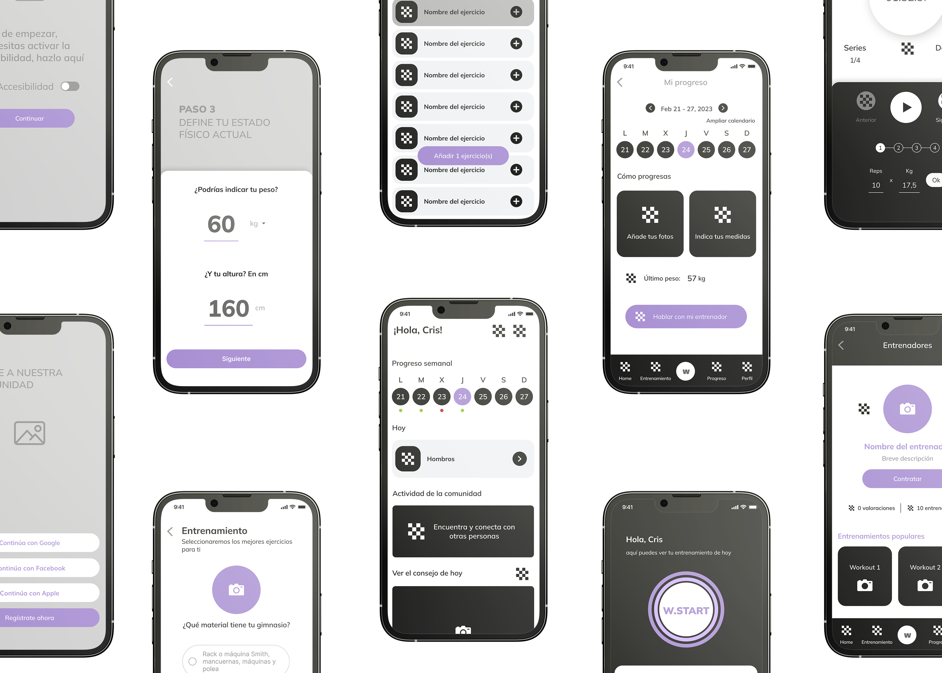
Before starting to design, it is necessary to create wireframes to check the usability and make some changes.
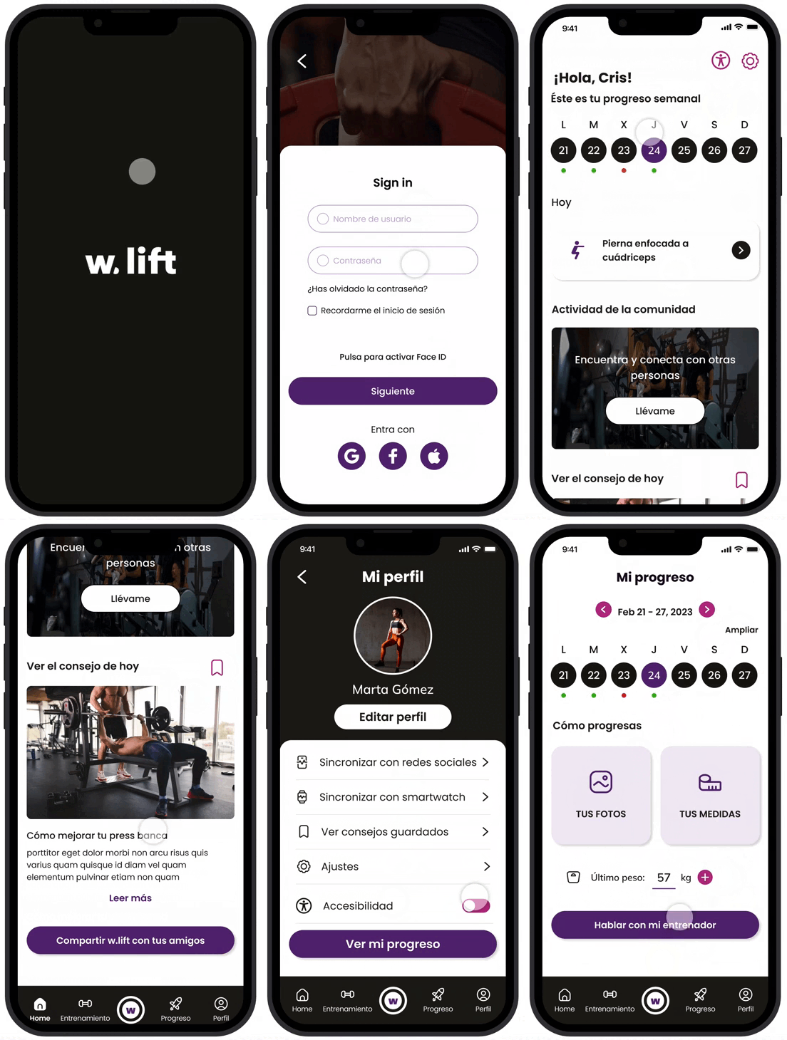
In this ocassion, they’re wireframes high-fi, to show the almost finished design:
UI – Design
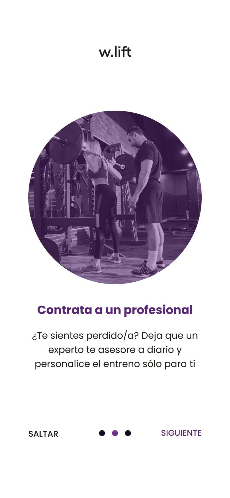
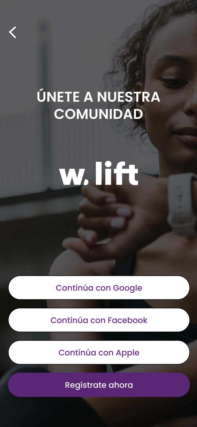
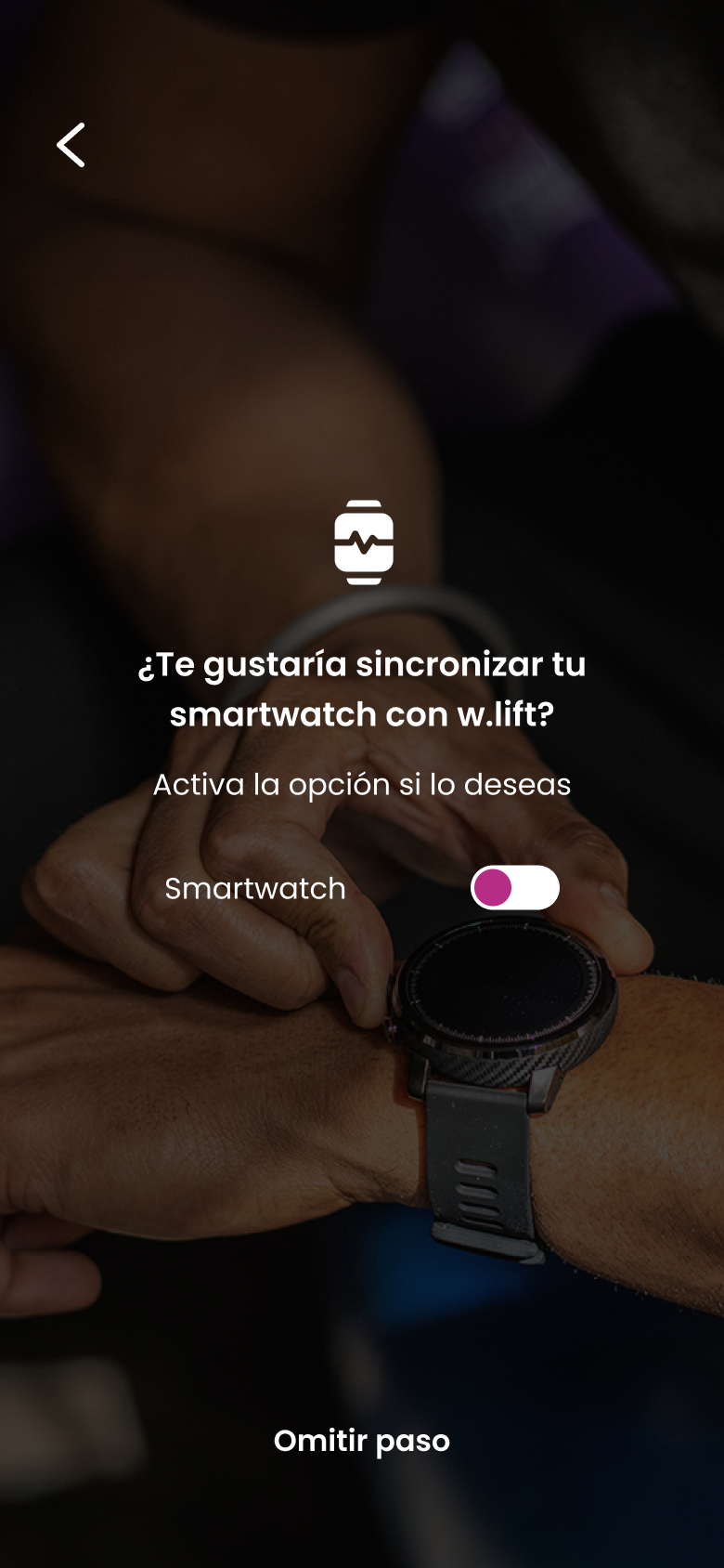
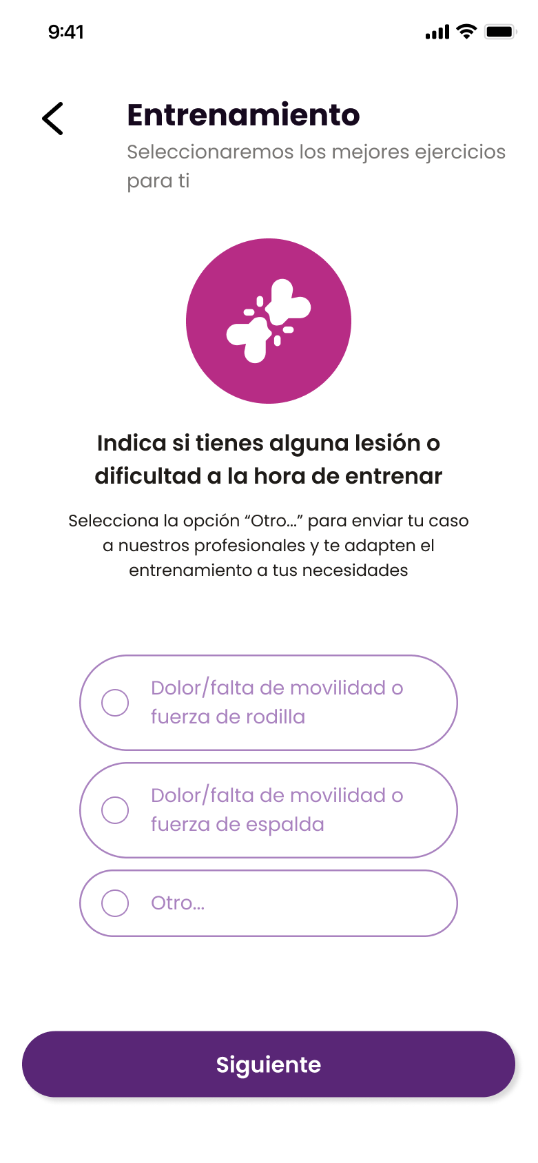
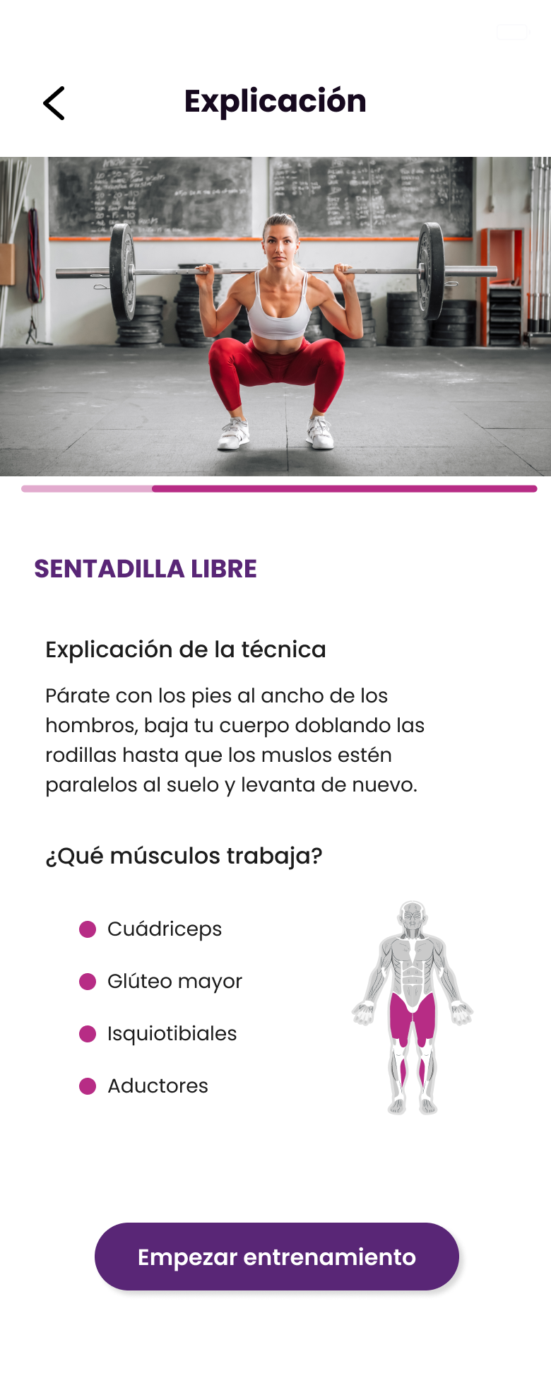
Some screens are:
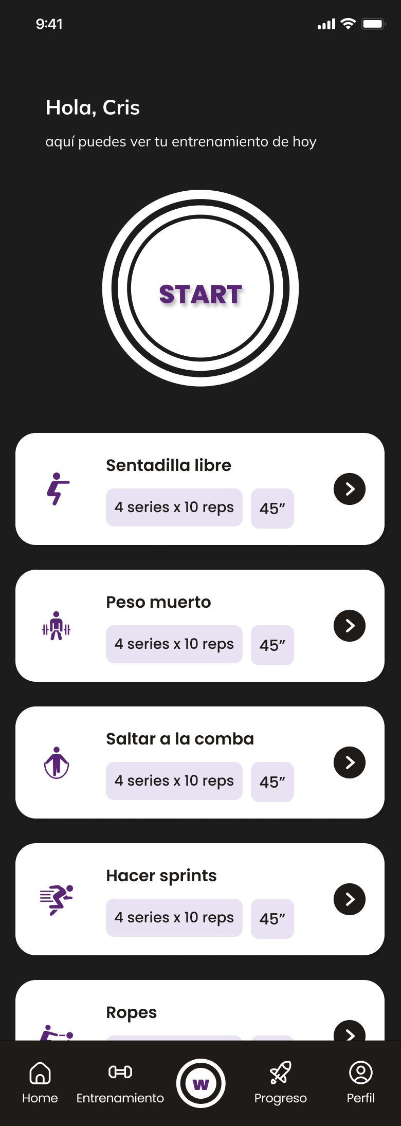
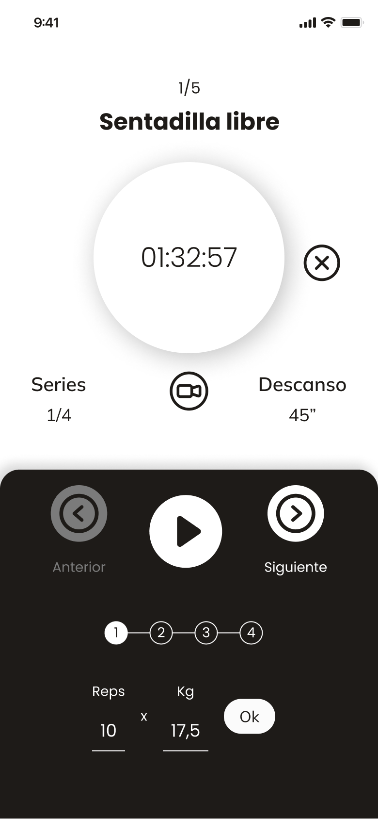

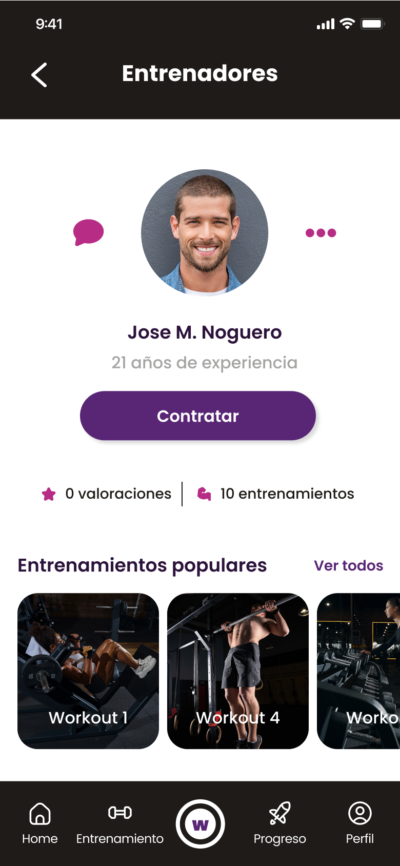

UI – Prototype
It is also important to see how all this screens interact together, in mobile but also in smartwatch:
