Fat Secret – (Re)Design
Goal
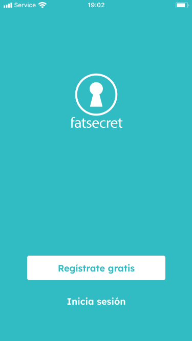
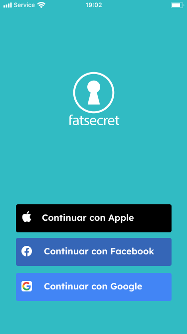
Redesign and improve the user experience of Fat secret
Role
Individual project
Methodology
Design Thinking
UX – Research
Let’s start at the beginning: what’s the main problem?
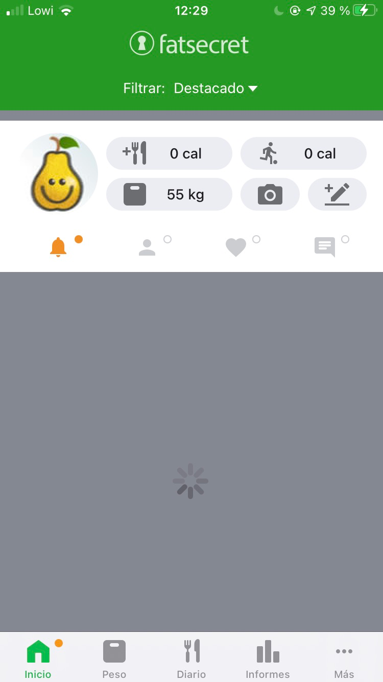
At first sight, the current design is not at all user-friendly, and there is excessive scrolling on most of the screens. On the other hand, recipes appear on the main screen of the app, Home, which is not at all relevant for most users.
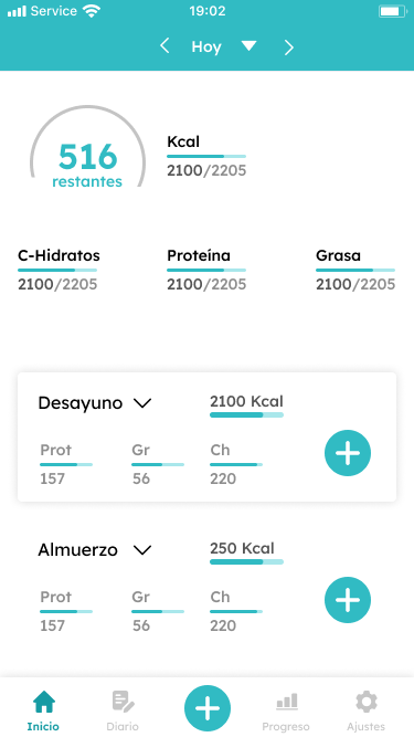
In general, there is no consonance between the main aim of the app and the result, since not even the macronutrients (CH, P and G) and kcal have an important role in the main screen where they appear, being something of the most relevant when using the app. This is why the app has undergone a complete redesign.
Who are the main competitors?
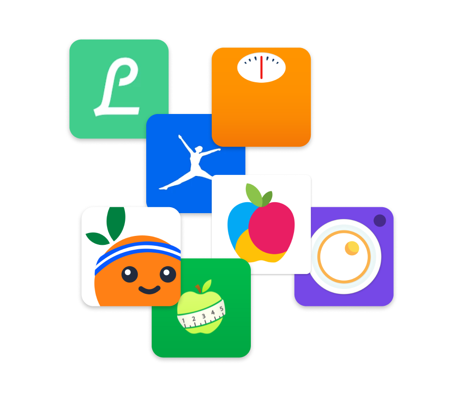
This led to a study of competitors such as Yazio, Myfitnesspal, Fooducate and some more.
Which are the goals?
In general and as a main task, usability has to be improved.
To be a bit more concrete:
- Remove features from the main screen that are not relevant to the user
- Prioritise the main feature: counting and recording the user’s daily calories
UI – Design
What about colours?
In terms of colours, the colour that stands out most in the app is, or should be, the same as the one applied in the corporate identity.
The fact is that there is a difference that can be seen at first glance, and it is a problem to be solved.
The green used in the app abounds in most of the screens, occupying a large part of them, and being accompanied by various shades of grey, black and white, mainly, although there are some details in other tones, as developed below.
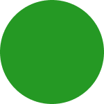
#259924
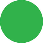
#31B24A
The secondary colour palette is also defined, as well as the contextual palette and the transparency palette.
#31B24A
#259924
#208D24
#4FAF4E
#BDE0BC
#6C6D71
#959595
#D0D0D9
#ECEDF2
#FFFFFF
#FFFF01
#EF8F2C
#FF898A
#06B2F7
#2D5FB0
Let’s complete with typography
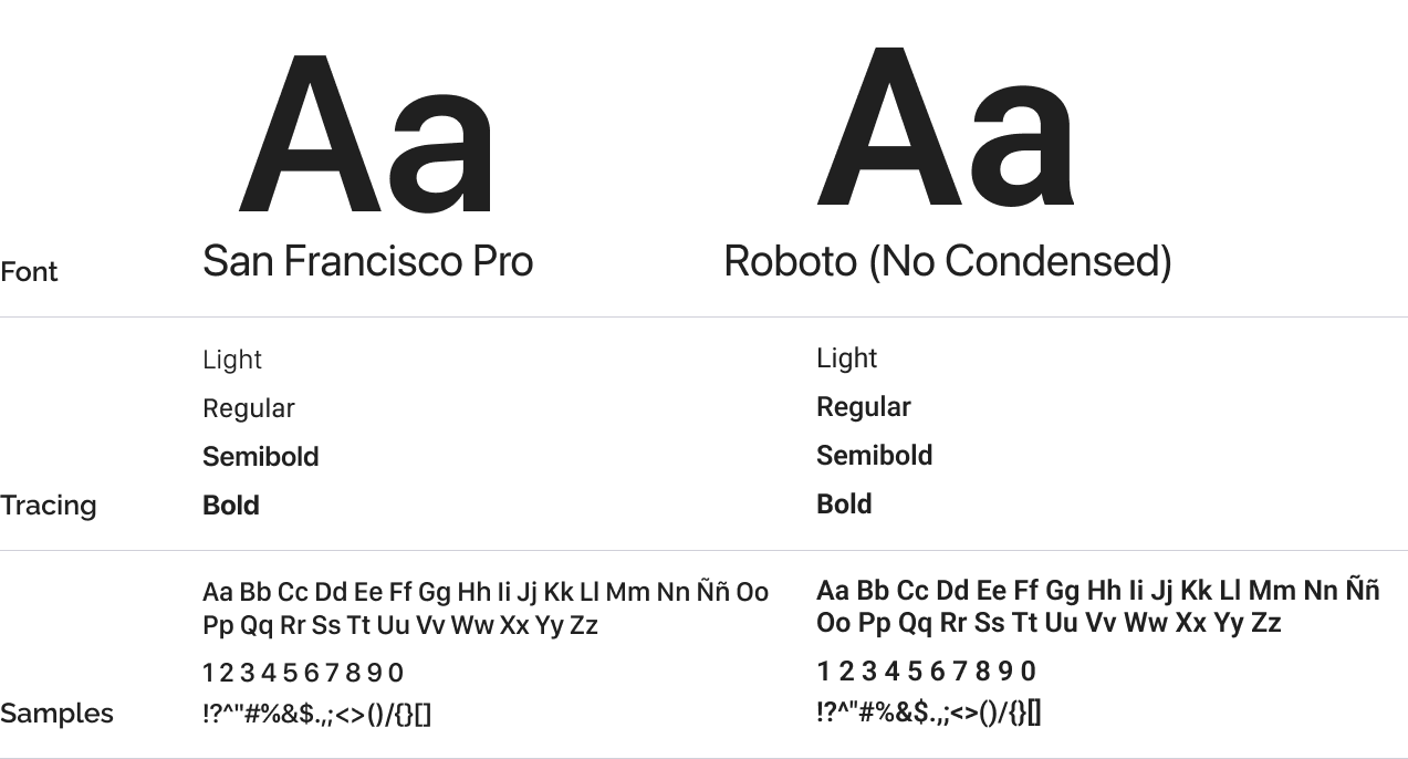
In terms of typography, they have chosen to use the standard typography for app development: in the case of iOS, San Francisco; in the case of Android, Roboto.
For neither of the two versions of the app is the use of italic or condensed, in the case of Roboto for Android.
Now which is the current iconography?
For the app icons we have used the Material Design library for both iOS and Android.
Some adaptations have been made, such as the burger menu in one case and the last option in the tab bar, both to see more settings.
Let’s see some of the components
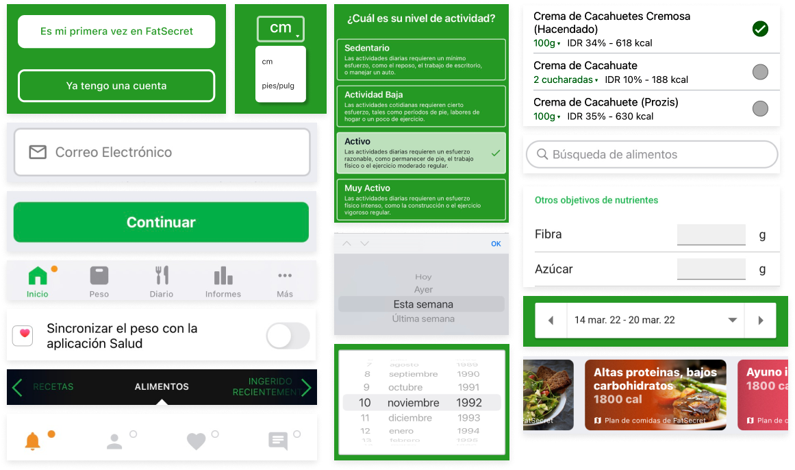
In addition to the tap bar, there is a variety of icons, radio buttons, text field, toggles, search field and also dropdown lists.
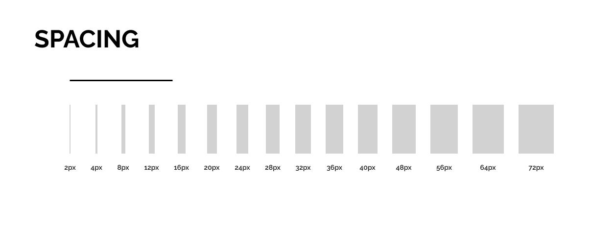
One thing to note is that there is no consistency between the different components, even on the same screen, in terms of colour, size, spacing or style.
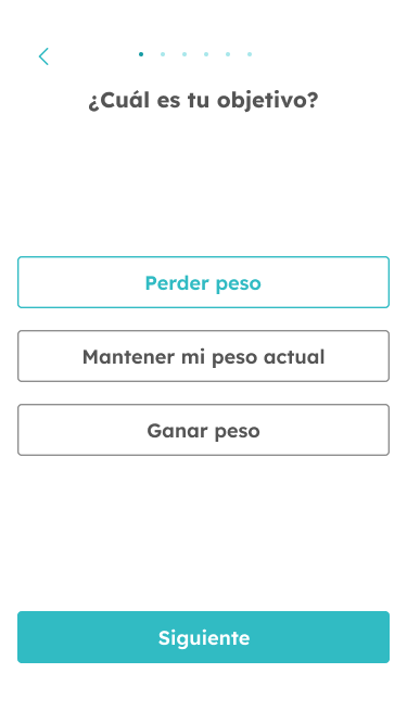
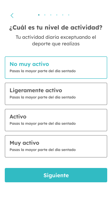
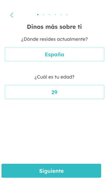
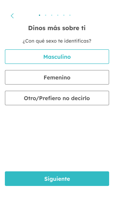
UI – RE-Design
Foundations & tokens
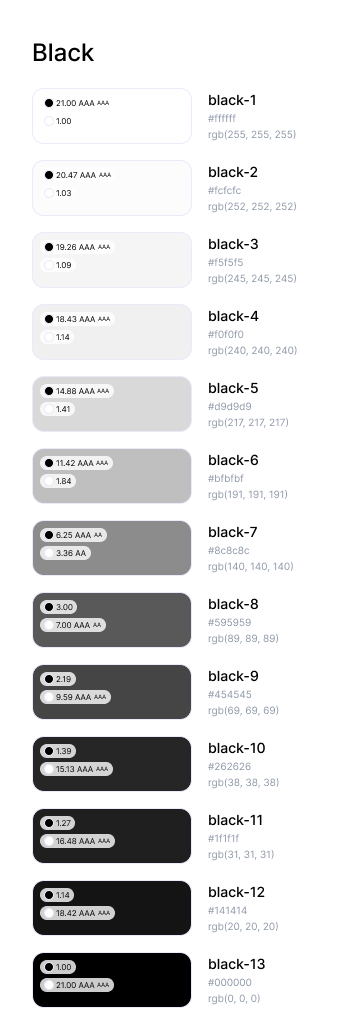
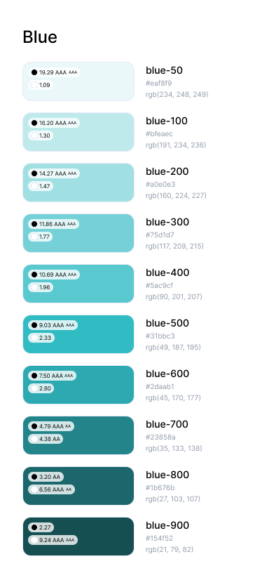
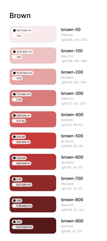
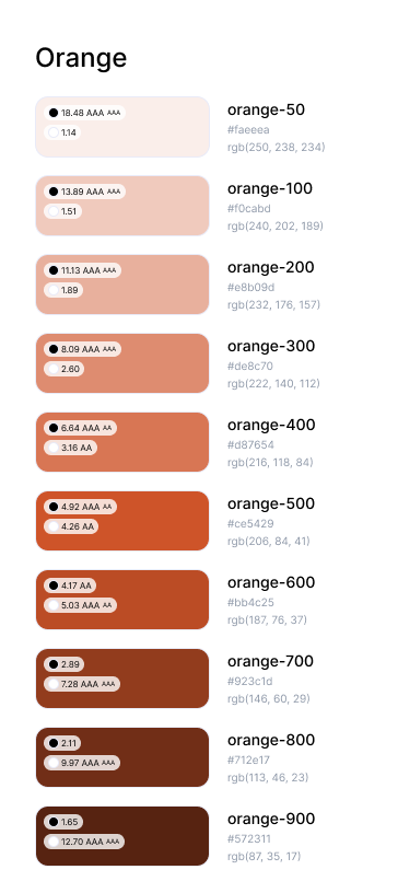
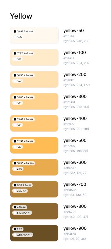
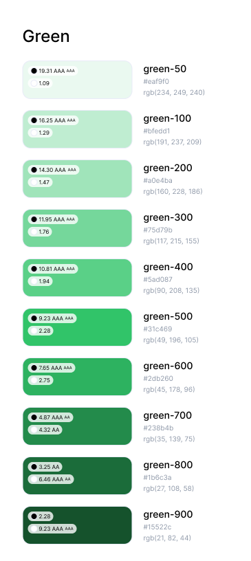
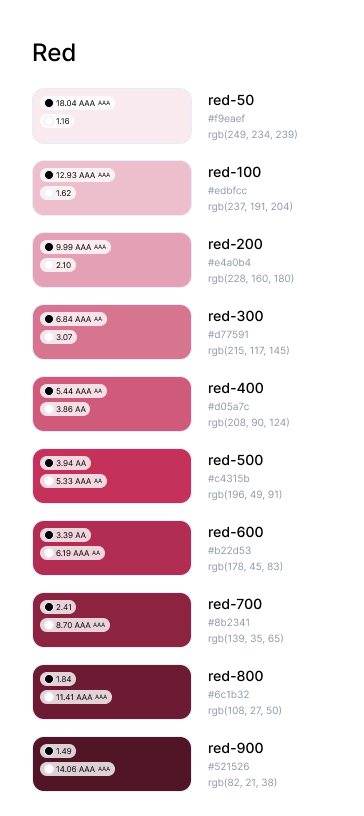
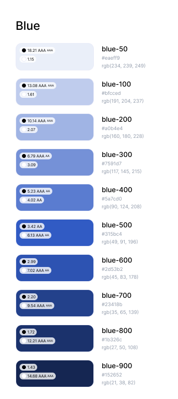
The main palette consists of one main colour, Blue, and two extra shades: red and orange. There is also a grey palette whose main colours are black and white.
On the other hand, there is the semantic colour palette consisting of four other colours.
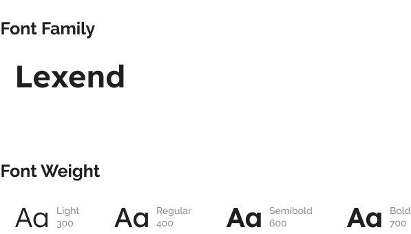
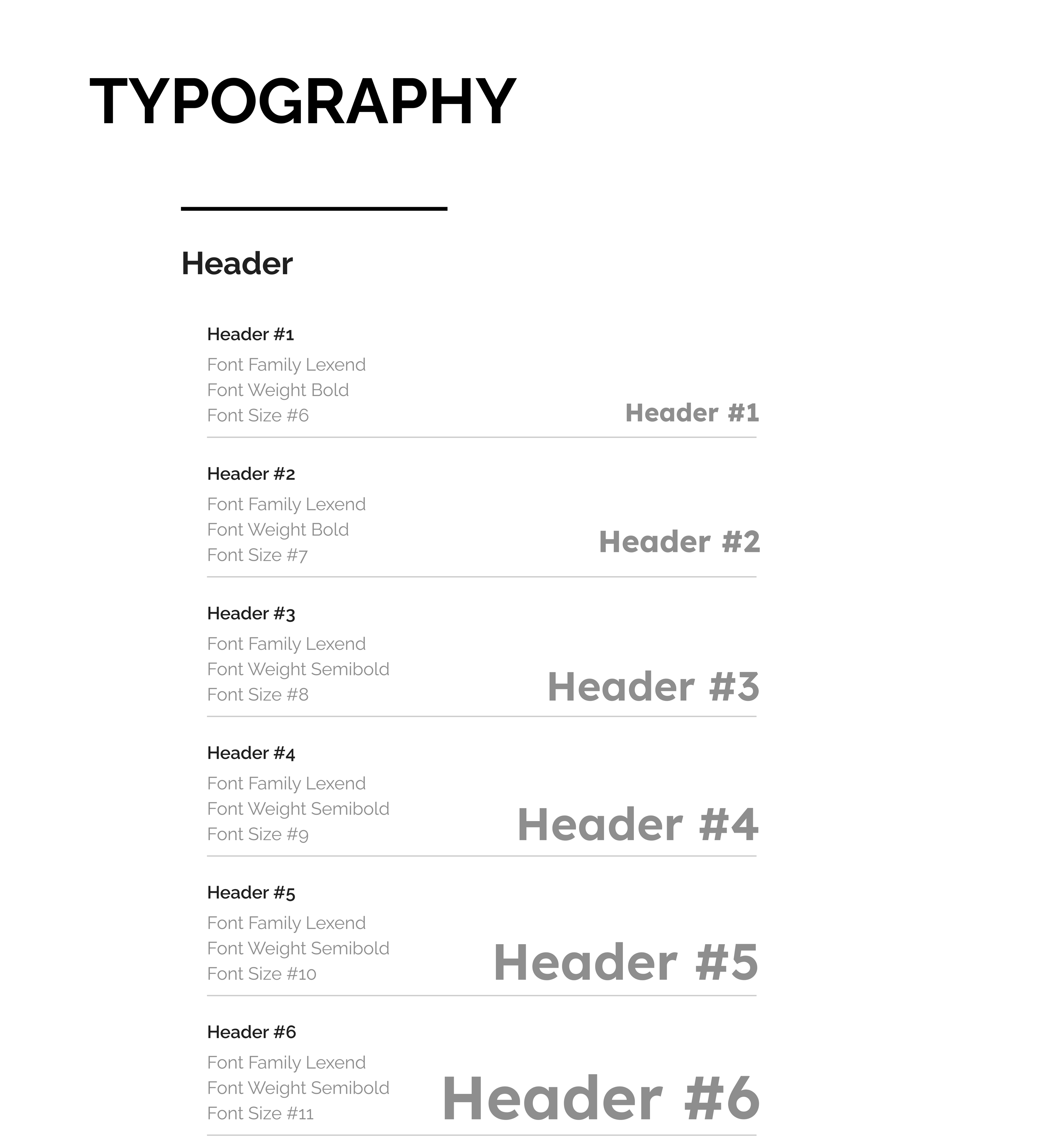
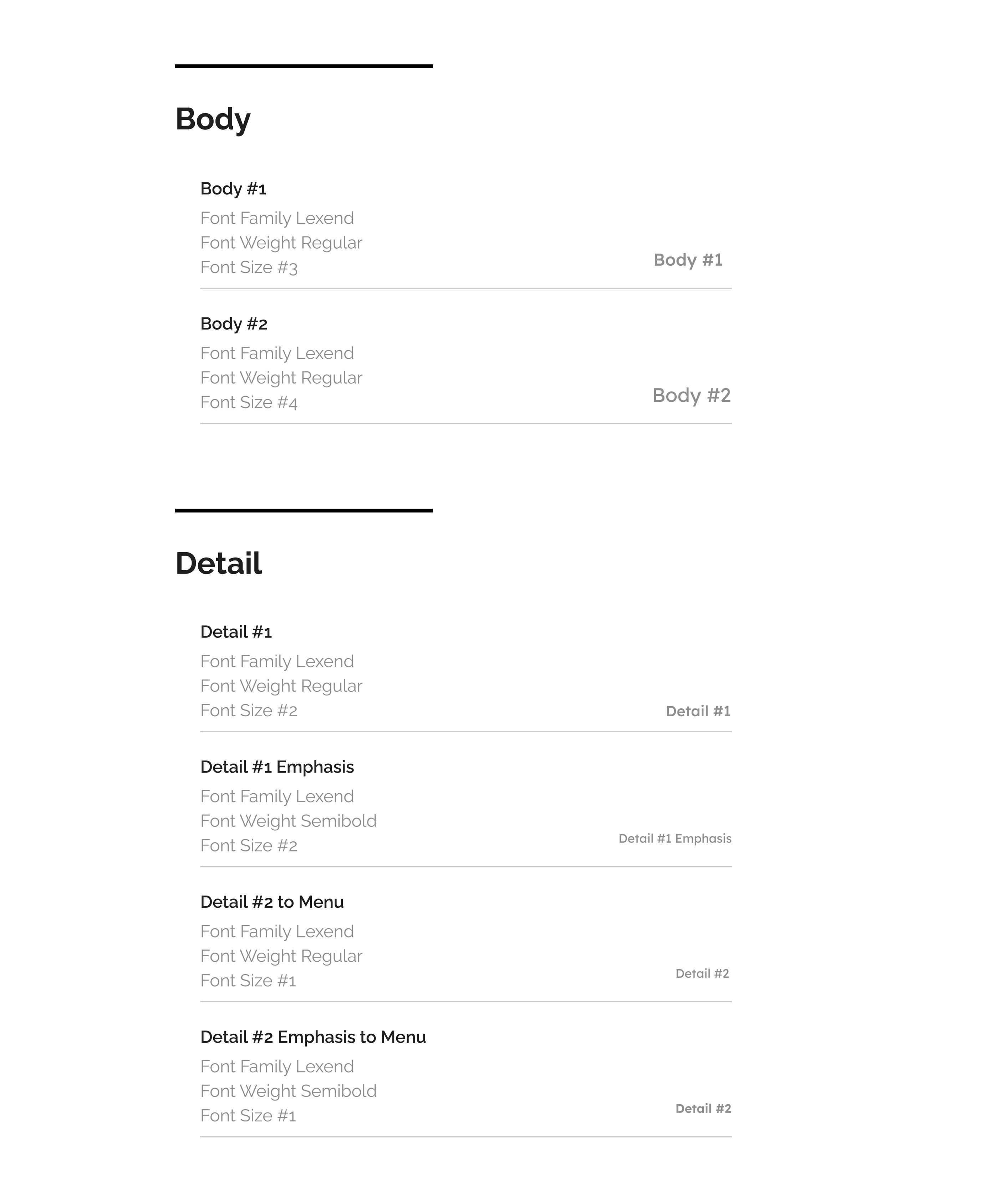
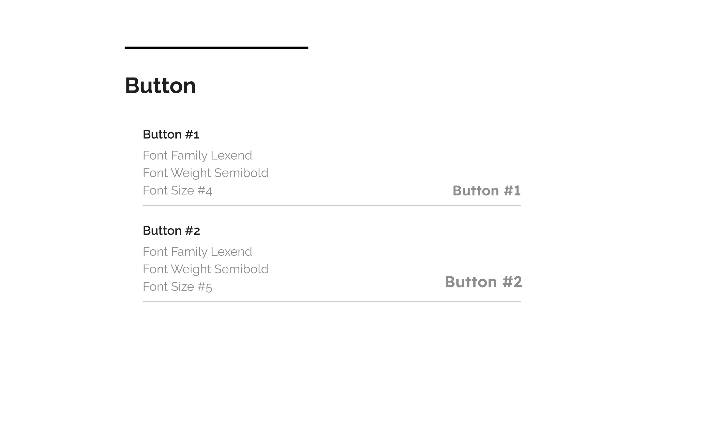
In terms of typography, Lexend has been chosen, with different weights depending on where it is to be used.
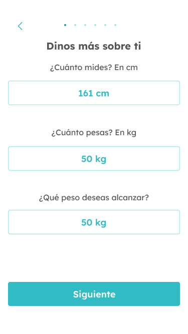
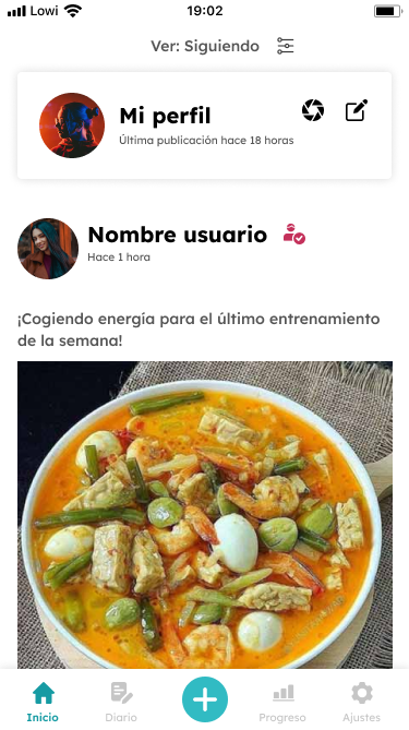
UI – Design
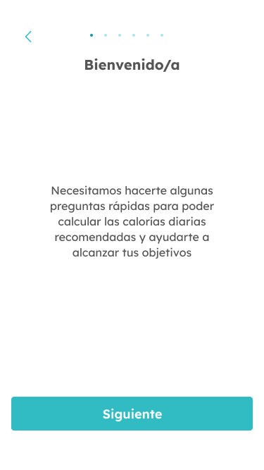
Some screens are:
