Epicity – UX/UI Case Study
Goal
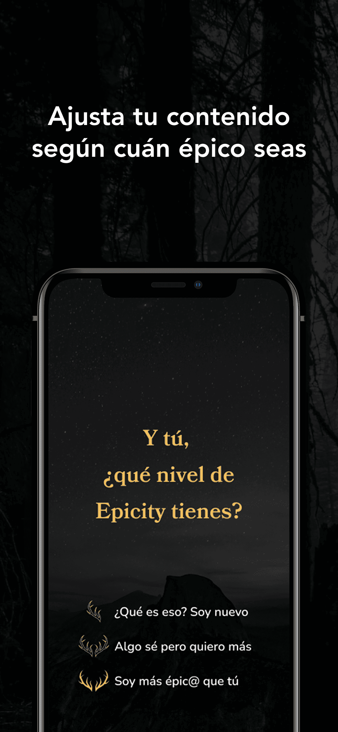
Creating an app to the user can listen to Epic music according to their level of “epicity”, which is modified depending on the music they listen to
Role
Individual project
Methodology
Design Thinking
UX – Research
Let’s start at the beginning: what’s the main problem?
There are several factors that interfere with the process of those individuals who want to improve their body: some don’t know where to start, they are unsure how many times a week they should train, what exercises to do, or the proper technique…
Who are the main competitors?
This led to a study of competitors such as Adidas, Nike, Freeletics, Gymshark and Sweat, among others.

Which are the goals?
In this way, the conclusion was that there were several essential goals that the new product had to meet in order to satisfy user needs:
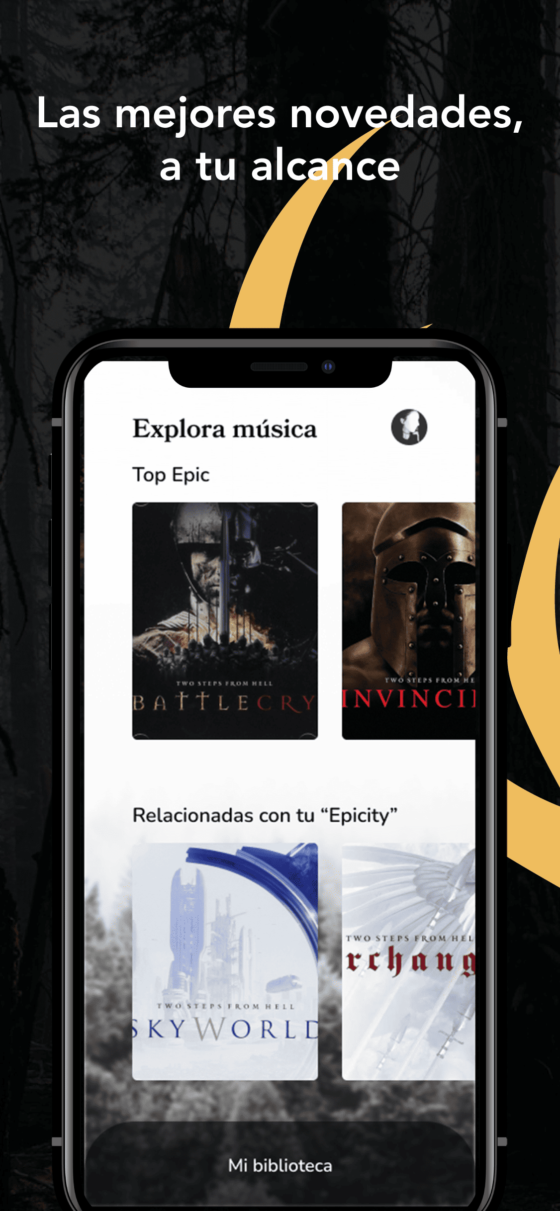
- Show a big library of epic music
- Change the artists depending on his location
Who would be the ideal client for this app?
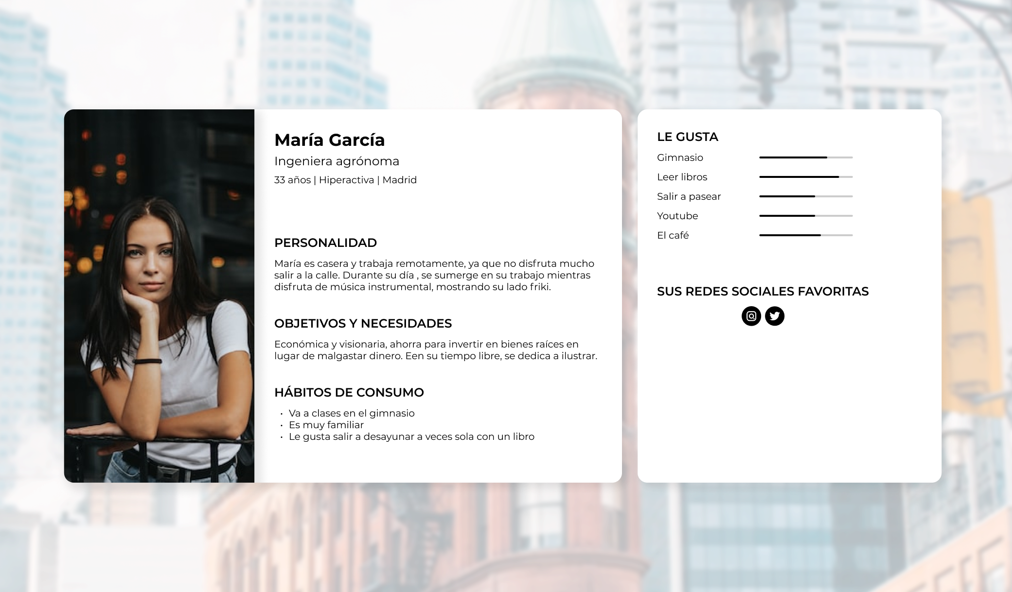
Laura is an engineer from Madrid, geek and lover of instrumental music, which she plays in the background while she works from home. She also listens to it on her way to the gym or while walking alone.
UX – Design
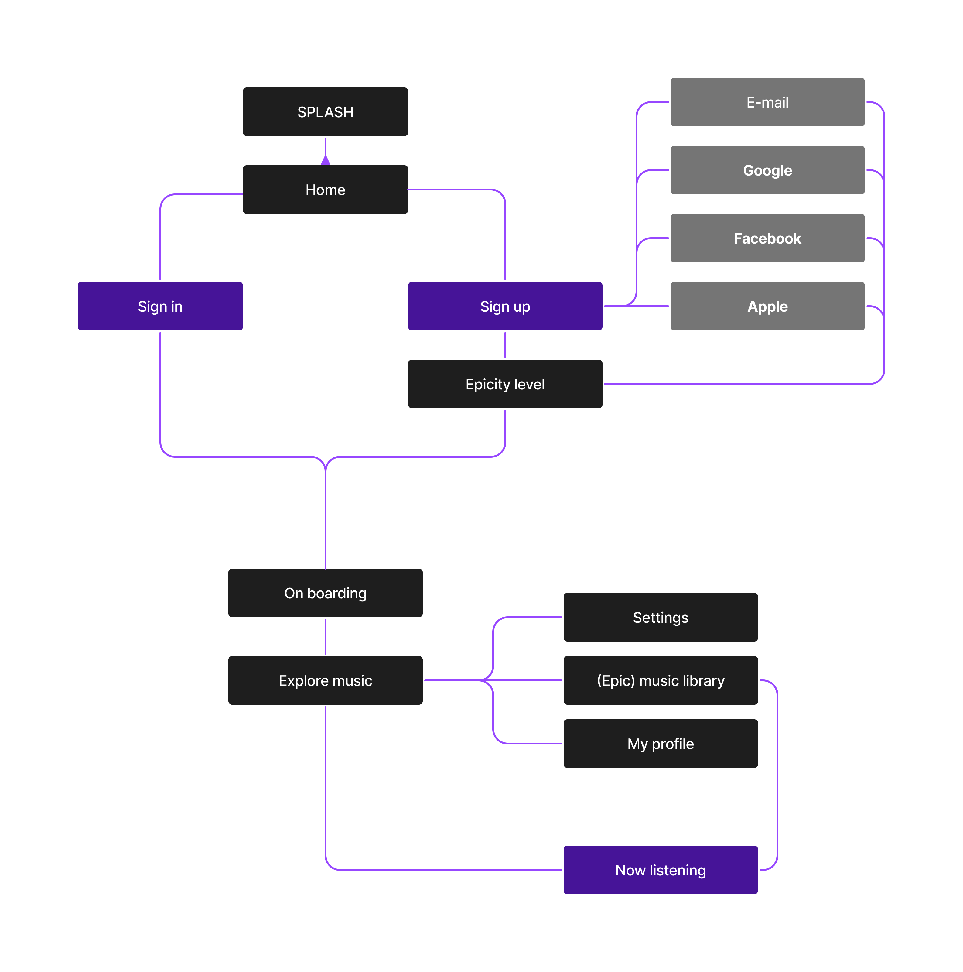
Defining the architecture
UX – Technology
Where will the music be from? First of all, we need GPS
Thanks to geolocation, users see personalised content based on where they are, showing them artists near them.
Let’s toggle everything!
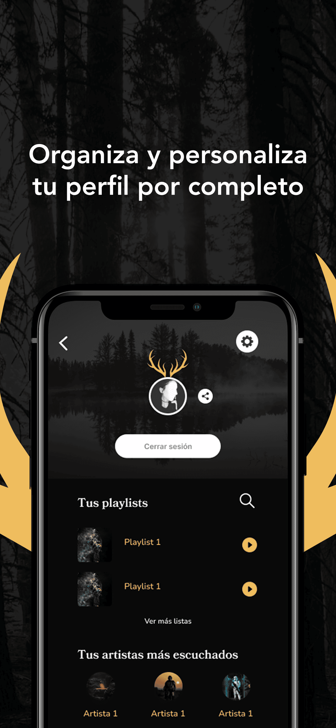
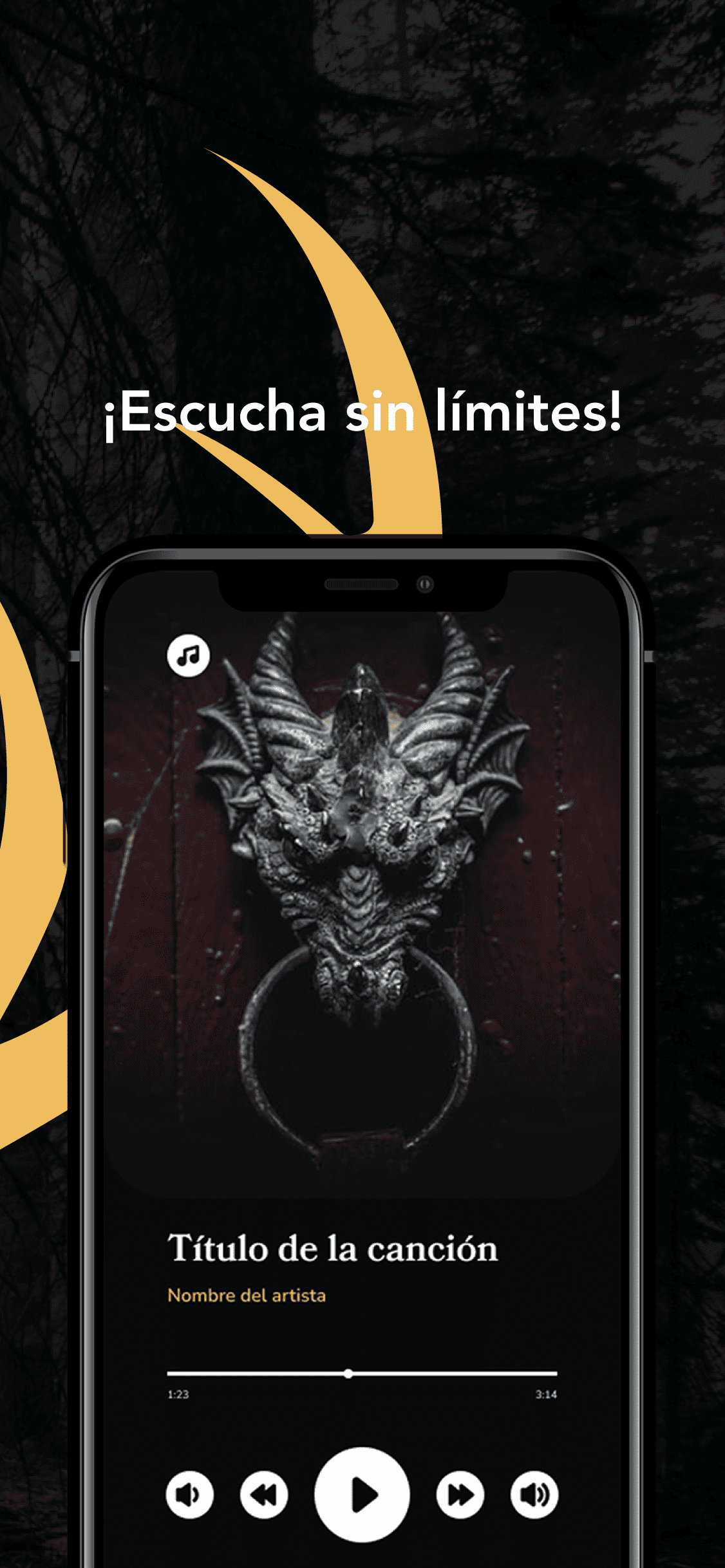
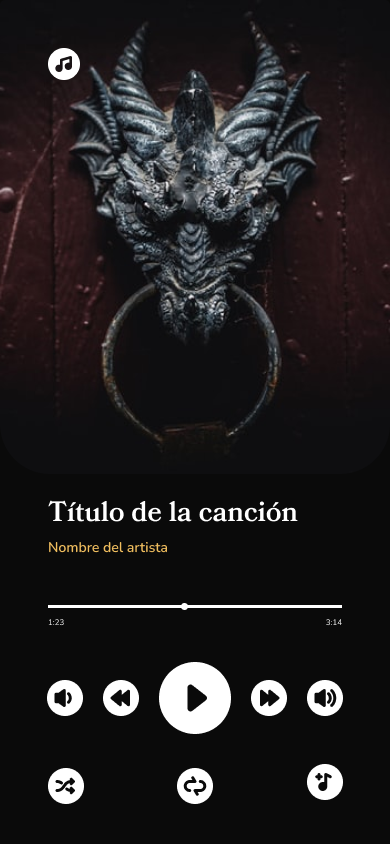
User can edit playlists, add songs to the library, change volume level, skip songs forward or backward and move along any track.
Second screen as protagonist while driving: Android Auto & Apple Carplay
Through the car’s touch panel or thanks to the Google Assistant or Siri, the user can access Epicity’s different functionalities, such as:
- Search for an artist or a specific track
- Change the volume level
- Skip to another song or repeat the one already played
This, in addition to reducing the risk of an accident while driving, is an advantage when listening to music.

UI – Design
Creating the branding
The logo consists of a typographic part under an isotype representing the horns of a deer, inspired by a deer because it is considered a legendary animal and related to forests and other areas commonly known as “epic”.
The head is chosen and the part of the horns is highlighted, as it is the most striking part of the animal.

What about colours?
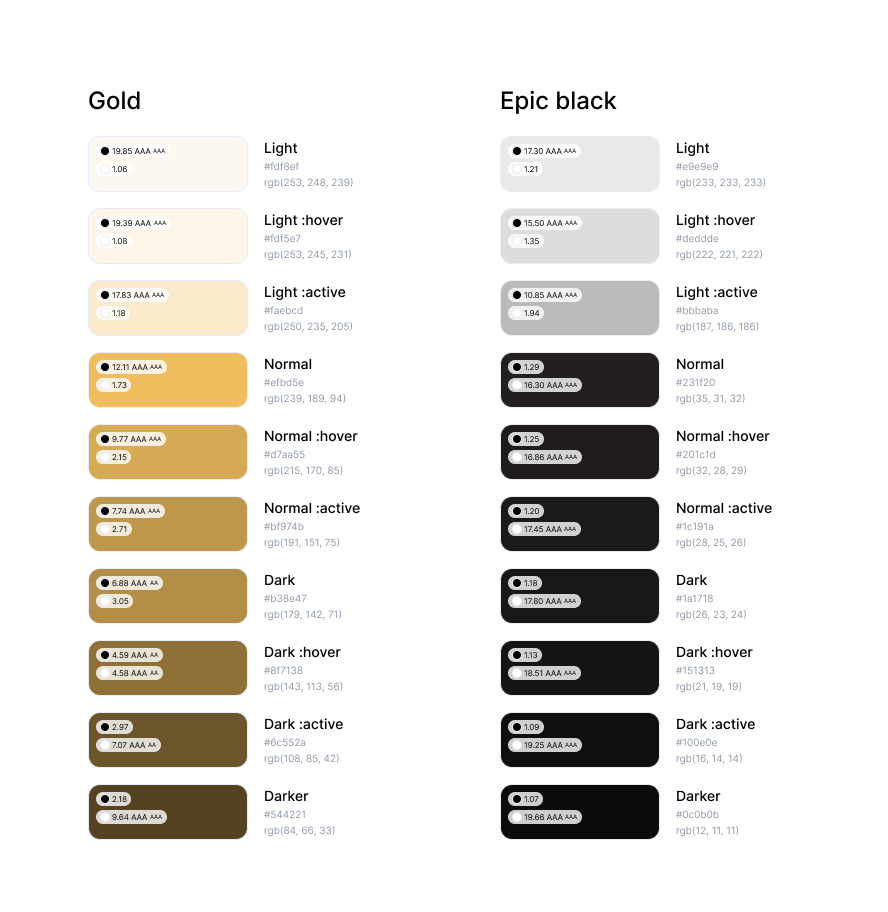
The chosen color palette encompasses a primary shade of purple, complemented by pure white and black, to convey the ideas of youth, power, ambition, strength, and within a sports context, control and dedication
Let’s complete with typography
The typography for the logo is Bookmania.
Also, as secondary and complementary typography, it’s been chosen Nunito Sans. Here they are in many of their different weights.


Now what can we do with the iconography?
The icons are displayed in both solid and linear styles. Their usage will depend on the sections of the application, and the needs of earch screen
UI – Wireframing
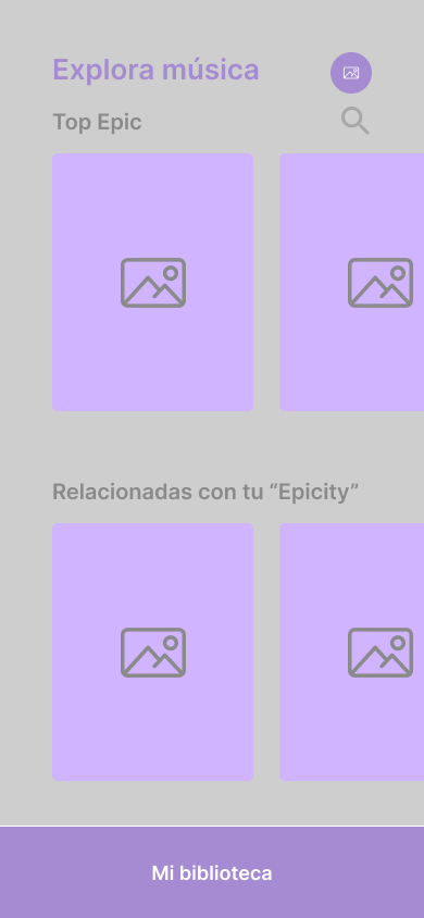
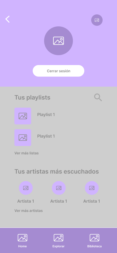
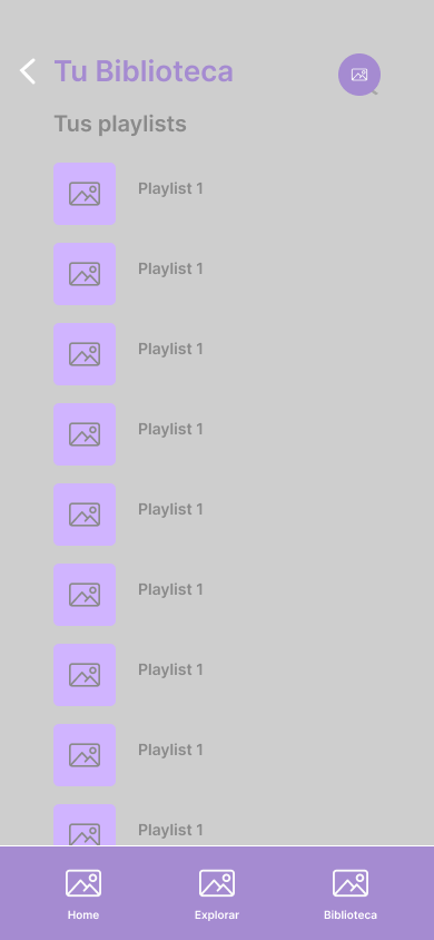
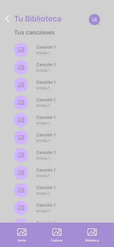
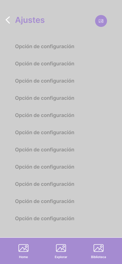
Before starting to design, it is necessary to create wireframes to check the usability and make some changes.
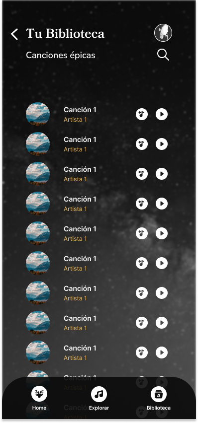
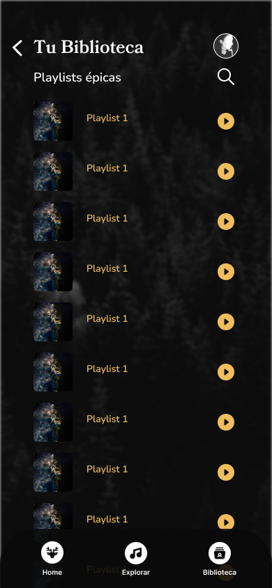
In this ocassion, they’re wireframes high-fi, to show the almost finished design:





UI – Design
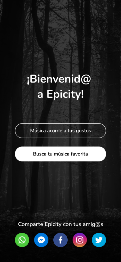
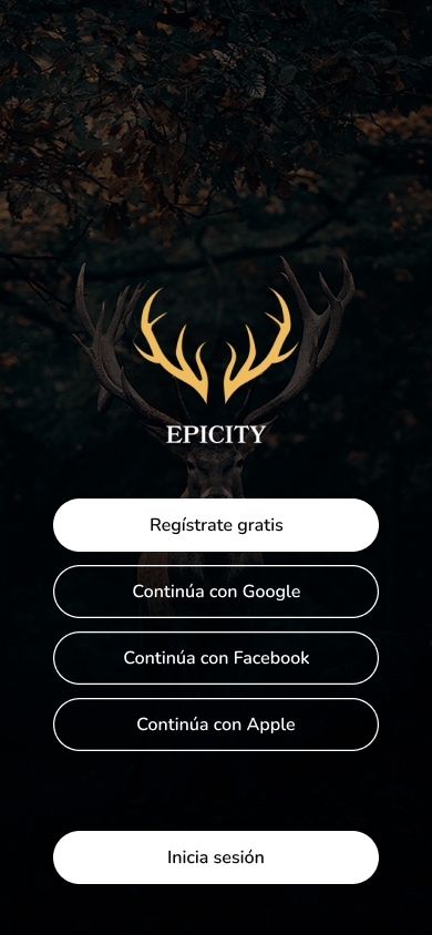
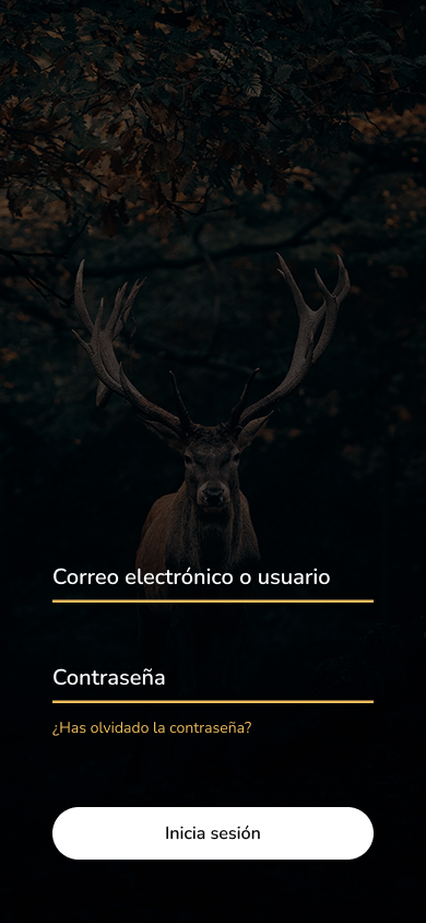
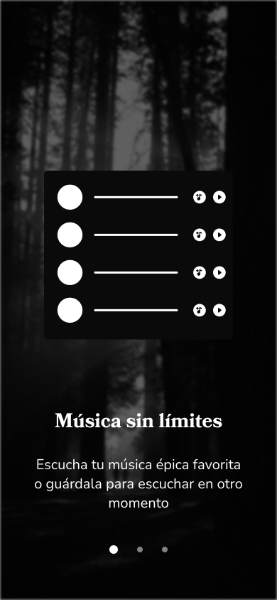
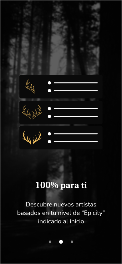
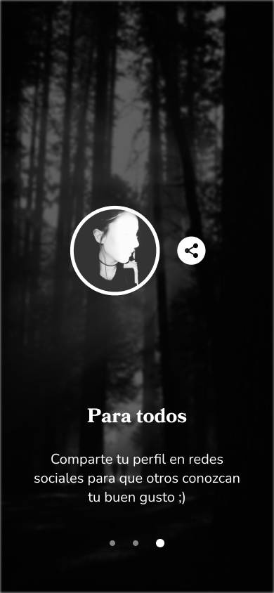
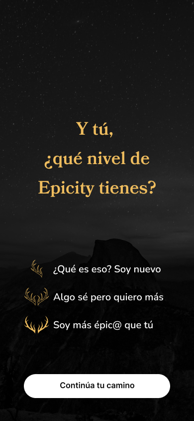
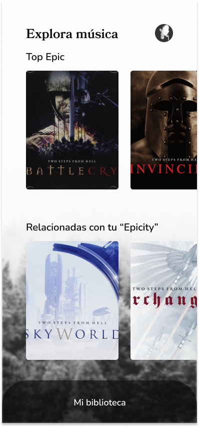
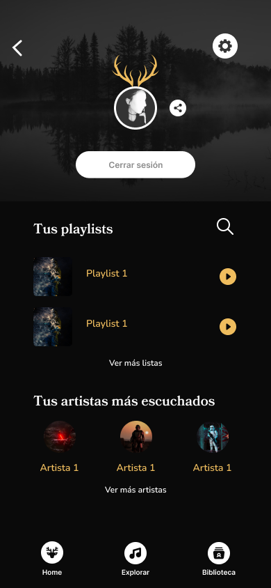
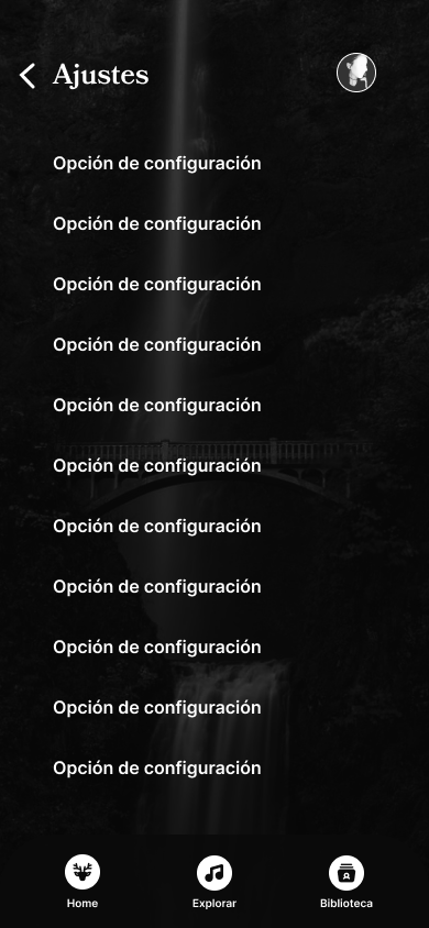
Some screens are:

UI – Store
